Sincere Tea
Role
UX/UI Design
Project Type
E-commerce Web App
Date
November 2024

Overview
As the UX/UI designer for this project, I designed the brand identity and an e-commerce responsive web app where customers can easily and intuitively browse and purchase goods from the online store.
Challenge
Develop a brand identity from scratch that's appropriate to the company and product
Build customer trust through consistency and alignment with brand's values
Design a modern and clean online storefront that’s simple and intuitive
Leverage user stories to create a seamless checkout experience
The Brief
For this brief, I was tasked with developing a brand identity from scratch and creating a comprehensive brand guidelines document. The brief also required a responsive web app design to sell goods online. The storefront needed to align with the brand stylistically and functionally - in both appearance and values. Additionally, specified feature requirements included the ability to filter inventory, view product recommendations, and a navigate checkout flow with minimal steps.
Process
Brand identity
The first step in this conceptual project was to create a strong brand identity and define specific brand guidelines for a modern and clean storefront. I created a comprehensive guide to make Sincere Tea a unique and memorable brand, establish trust through visual consistency, and lay the groundwork for a cohesive user experience.

Gathering requirements
In this stage, I defined key features based on user needs, including inventory filtering, personalized product recommendations, and a streamlined checkout flow. I chose these features based on the user stories laid out in the project brief.

Ideation
I created a user flow diagram to outline the steps a customer would take in the shopping experience to browse, select items, and checkout easily and intuitively. Low fidelity wireframe sketches were required to demonstrate how the steps would look on a simplified screen. These progressed into a more fleshed-out set of mid-fidelity wireframes.


Prototyping
I created a user flow diagram to outline the steps a customer would take in the shopping experience to browse, select items, and checkout easily and intuitively. Low fidelity wireframe sketches were required to demonstrate how the steps would look on a simplified screen. These progressed into a more fleshed-out set of mid-fidelity wireframes.

Usability
I created a user flow diagram to outline the steps a customer would take in the shopping experience to browse, select items, and checkout easily and intuitively. Low fidelity wireframe sketches were required to demonstrate how the steps would look on a simplified screen. These progressed into a more fleshed-out set of mid-fidelity wireframes.

Key Revisions
I created a user flow diagram to outline the steps a customer would take in the shopping experience to browse, select items, and checkout easily and intuitively. Low fidelity wireframe sketches were required to demonstrate how the steps would look on a simplified screen. These progressed into a more fleshed-out set of mid-fidelity wireframes.
Final Designs
Connect to Content
Add layers or components to infinitely loop on your page.
Solution
I addressed the user stories presented in the brief directly through corresponding features in the product design. Features include filtering options, product recommendations in the checkout drawer, and a clean checkout flow.
Website traffic
Social media engagement
Increased sales
Impact
My goal with Sincere Tea was to establish a cohesive and memorable brand identity while creating a seamless user experience. If this e-commerce site launched, I would measure success through user engagement, brand awareness, and customer feedback. Key benchmarks would include social media engagement, website traffic, and usability testing outcomes.
Reflection
Challenge
Ensuring both mobile and desktop versions of the shop maintained a high level of design quality.
Enhancing the usability of the checkout drawer by making product recommendations easier to view and add.
Developing a strong brand identity and applying it consistently throughout all screens.
Solution
I reused common components and studied examples from successful online shops to guide my decisions. Viewing the designs side by side allowed me to confirm that both versions were well-suited to their respective devices.
I modified the checkout drawer overlay to include suggested items. This also addressed the user story: “As a frequent customer, I want to see recommendations of products I may like, so that I find items I might not otherwise on my own.”
I created a thorough set of design guidelines, which streamlined the branding process. Feedback highlighted that the design was “nice and polished,” with harmonious imagery and colors.
Next steps
Expanded Ui flows
Build out the UI flows more extensively to account for a broader range of user interactions and scenarios.
Custom illustration set
Expand on the existing illustrated logo by creating a complementary set of simple illustrations. These could include designs for a “Success” modal, “Error” screen, and other key UI elements, matching the style of the teapot and cup icons.
accessibility features
Address user stories that require accessible features, such as an option to make text larger for readability.
…Check out this case study:
This app design transforms a classic card game into a cozy game app and infuses it with the playful aesthetic of the well-loved Dusen Dusen brand.
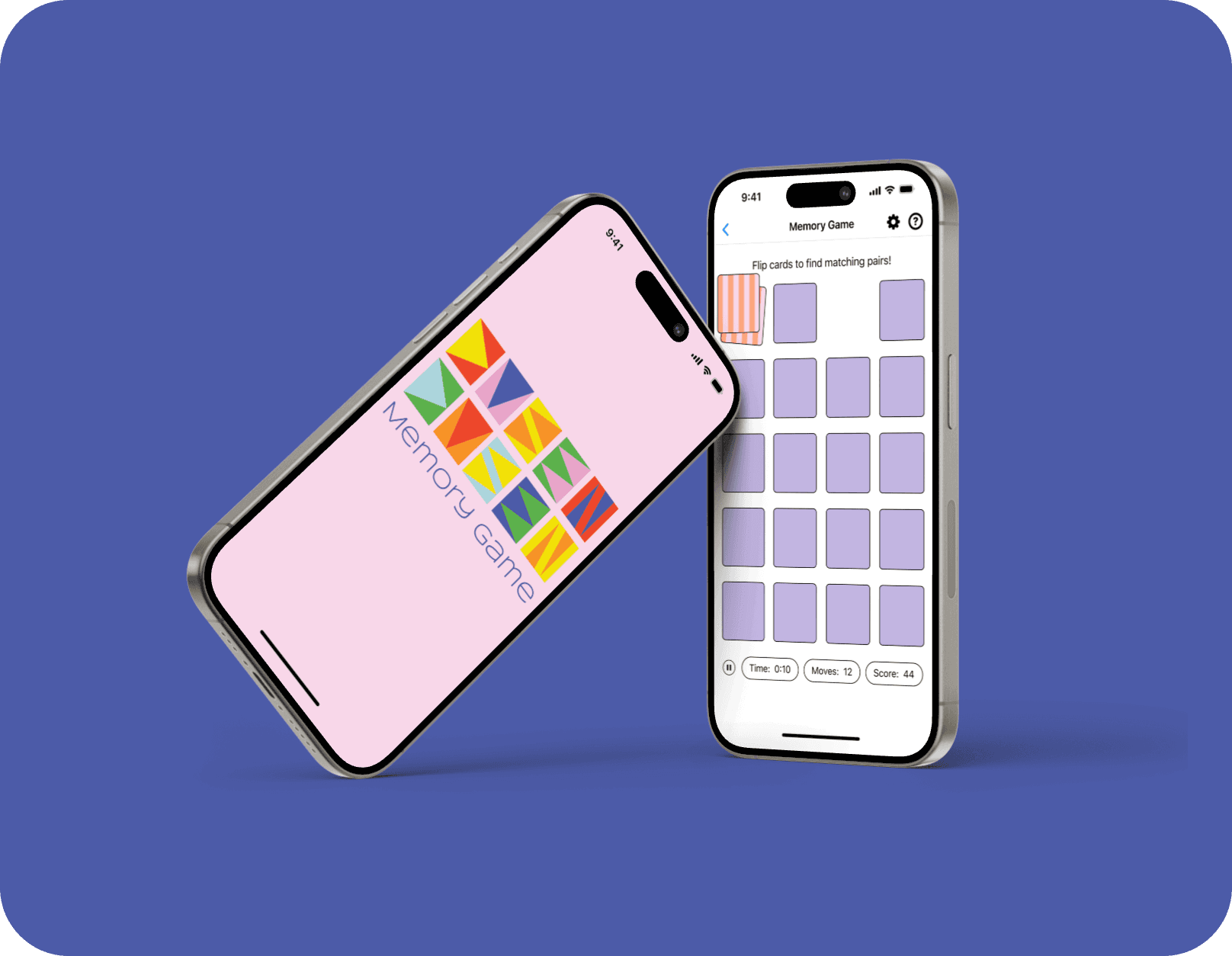
Sincere Tea
Role
UX/UI Design
UX/UI Design
Project Type
E-commerce Web App
E-commerce Web App
Date
November 2024
November 2024
Overview
As the UX/UI designer for this project, I designed the brand identity and an e-commerce responsive web app where customers can easily and intuitively browse and purchase goods from the online store.
As the UX/UI designer for this project, I designed the brand identity and an e-commerce responsive web app where customers can easily and intuitively browse and purchase goods from the online store.
Challenge
Develop a brand identity from scratch that's appropriate to the company and product
Build customer trust through consistency and alignment with brand's values
Design a modern and clean online storefront that’s simple and intuitive
Leverage user stories to create a seamless checkout experience
The Brief
For this brief, I was tasked with developing a brand identity from scratch and creating a comprehensive brand guidelines document. The brief also required a responsive web app design to sell goods online. The storefront needed to align with the brand stylistically and functionally - in both appearance and values. Additionally, specified feature requirements included the ability to filter inventory, view product recommendations, and a navigate checkout flow with minimal steps.
Process
Brand identity
The first step in this conceptual project was to create a strong brand identity and define specific brand guidelines for a modern and clean storefront. I created a comprehensive guide to make Sincere Tea a unique and memorable brand, establish trust through visual consistency, and lay the groundwork for a cohesive user experience.
Gathering requirements
In this stage, I defined key features based on user needs, including inventory filtering, personalized product recommendations, and a streamlined checkout flow. I chose these features based on the user stories laid out in the project brief.
Ideation
I created a user flow diagram to outline the steps a customer would take in the shopping experience to browse, select items, and checkout easily and intuitively. Low fidelity wireframe sketches were required to demonstrate how the steps would look on a simplified screen. These progressed into a more fleshed-out set of mid-fidelity wireframes.
Prototyping
I then created an interactive flow using the mid-fidelity wireframes, which allowed for my checkout experience to be user tested at this point. I gave 4 user testing participants a task to complete using grayscale mid-fidelity prototypes: add multiple items to the cart. The steps involved adding one product to the cart, viewing and selecting a suggested item, and ending on the checkout page.
Usability
Participants revealed a few key issues about this design iteration. 1. frustration that the checkout drawer appeared scrollable but was not; 2. the main text was thought to be too small, especially in the top navigation; and 3. expectations were not met when clicking suggested items. Performing user testing at this stage gave me the chance to address these pain points before the moving on to the final designs.
Key Revisions
Using the key takeaways from usability testing, I implemented the following improvements: 1. I made the checkout drawer scrollable, and eliminated the unnecessary scroll bar 2. I made the suggested items in checkout drawer easier to view/add with a clearer UI card and ‘add to cart’ button, and 3. I increased the font size in the top navigation across the site for easier readability.
Final Designs


Solution
I addressed the user stories presented in the brief directly through corresponding features in the product design. Features include filtering options, product recommendations in the checkout drawer, and a clean checkout flow.
Website traffic
Social media engagement
Increased sales
Impact
My goal with Sincere Tea was to establish a cohesive and memorable brand identity while creating a seamless user experience. If this e-commerce site launched, I would measure success through user engagement, brand awareness, and customer feedback. Key benchmarks would include social media engagement, website traffic, and usability testing outcomes.
Reflection
Challenge
Ensuring both mobile and desktop versions of the shop maintained a high level of design quality.
Enhancing the usability of the checkout drawer by making product recommendations easier to view and add.
Developing a strong brand identity and applying it consistently throughout all screens.
Solution
I reused common components and studied examples from successful online shops to guide my decisions. Viewing the designs side by side allowed me to confirm that both versions were well-suited to their respective devices.
I modified the checkout drawer overlay to include suggested items. This also addressed the user story: “As a frequent customer, I want to see recommendations of products I may like, so that I find items I might not otherwise on my own.”
I created a thorough set of design guidelines, which streamlined the branding process. Feedback highlighted that the design was “nice and polished,” with harmonious imagery and colors.
Next steps
Expanded Ui flows
Build out the UI flows more extensively to account for a broader range of user interactions and scenarios.
Custom illustration set
Expand on the existing illustrated logo by creating a complementary set of simple illustrations. These could include designs for a “Success” modal, “Error” screen, and other key UI elements, matching the style of the teapot and cup icons.
Accessibility Features
Address user stories that require accessible features, such as an option to make text larger for readability.